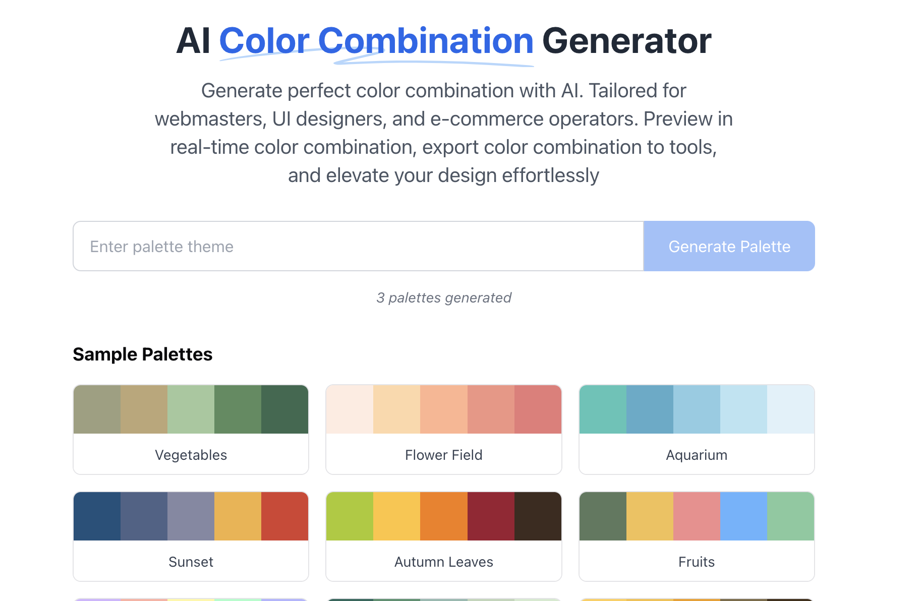
AI Color Combination Generator
Generate perfect color combination with AI. Tailored for webmasters, UI designers, and e-commerce operators. Preview in real-time color combination, export color combination to tools, and elevate your design effortlessly
Sample Palettes
- Vegetables
- Flower Field
- Aquarium
- Sunset
- Autumn Leaves
- Fruits
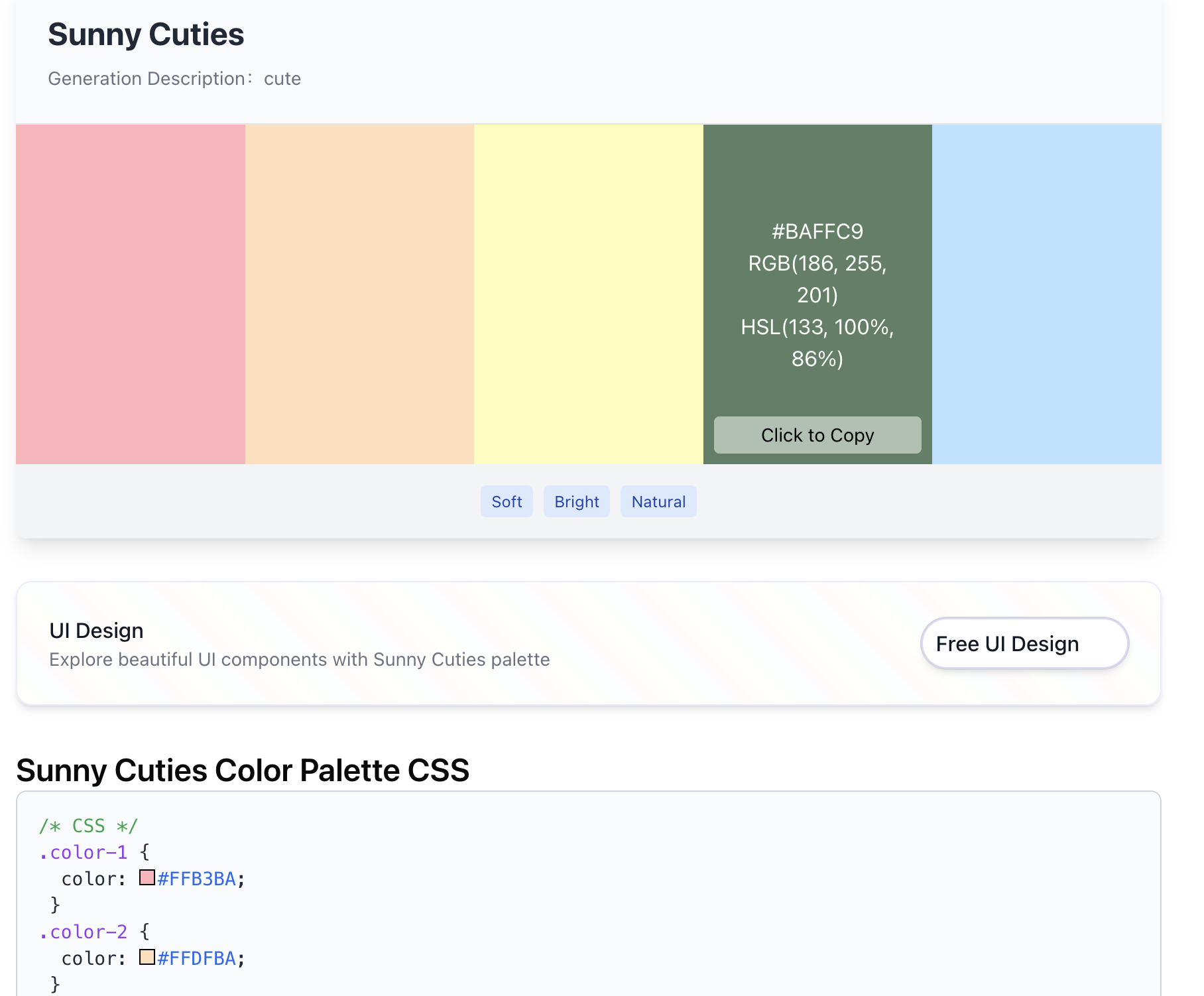
- Cute
- Forest
- Sunflower
- Romantic
- Campfire
- Beach
- Sunset
- Spring
- Youthful
- Snowboarding
- Red Brick
- Aquarium
- Winter
- Unicorn
- Chocolate
- Sea
- Energetic
AI Color Harmony Showcase
Frequently Asked Questions about the AI Color Combination Generator
Discover expert answers to common questions about using the AI Color Combination Generator effectively.
Q: How does the AI generate color combination?
A: Our AI leverages machine learning, trained on extensive color palette datasets and design trends, to deliver harmonious and trendy color combination tailored to your needs.
Q: Can I tweak the AI-generated color schemes?
A: Absolutely! Adjust the suggestions or input specific keywords to customize your color combination for any project.
Q: What templates can I preview my color palette on?
A: Explore a range of templates, including website layouts, mobile app designs, and e-commerce product pages, all available for real-time rendering.
Q: Is the AI Color Combination Generator free?
A: We offer a free tier with core features. Upgrade to premium for unlimited exports, advanced tools, and exclusive templates.
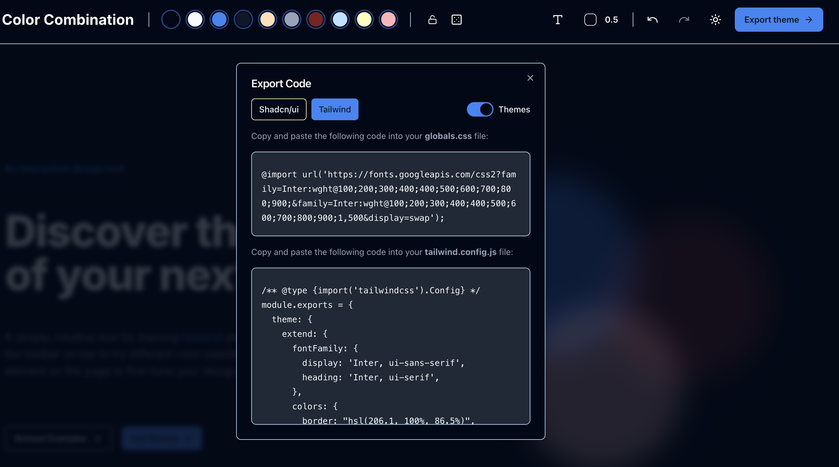
Q: How do I export my color combination?
A: With one click, export your color palette to your preferred design tool—ready to enhance your project instantly.
Q: What are the key principles of color combination?
A: The key principles of color combination include harmony, contrast, and balance. Harmony refers to the pleasing arrangement of colors that work well together, creating a cohesive look. Designers often rely on the color wheel to identify harmonious combinations, such as complementary, analogous, and triadic schemes. Each of these schemes offers a unique way to create visual interest and emotional impact.
Contrast, on the other hand, is essential for drawing attention to specific elements within a design. High contrast color combination, like complementary colors, can make important features stand out, while low contrast combinations can create a more subtle and sophisticated appearance. Achieving the right balance between harmony and contrast is crucial for effective design.
Balance involves distributing colors evenly throughout a design to create a sense of stability. A well-balanced color palette can enhance the overall aesthetic and ensure that no single element overwhelms the others.
Q: How can I effectively use color combination in branding?
A: Effective use of color combination in branding is vital for conveying a brand's identity and values. Colors evoke emotions and associations, so choosing the right color combination can significantly impact how a brand is perceived. For example, blue is often associated with trust and professionalism, making it a popular choice for financial institutions and tech companies.
To create a strong brand identity, consider using a primary color that reflects your brand's core message, complemented by secondary colors that enhance and support that message. It's also essential to maintain consistency across all branding materials, from logos to websites, to reinforce brand recognition.
Additionally, understanding color psychology can help in selecting color combination that resonate with your target audience. Conducting market research to identify color preferences within your demographic can further refine your choices.
Q: What role does color combination play in user experience design?
A: In user experience (UX) design, color combination are crucial for guiding user behavior and enhancing usability. Colors can influence how users interact with a product, affecting their navigation and overall satisfaction. For instance, using contrasting colors for call-to-action buttons can make them more noticeable, encouraging users to engage with the content.
Moreover, a well-thought-out color scheme can improve readability and accessibility. High contrast between text and background colors ensures that content is legible for all users, including those with visual impairments. Therefore, considering color combinations in UX design is not just about aesthetics; it's about creating an inclusive and effective user experience.
Q: How can I experiment with color combinations using the AI Color Combination Generator?
A: The AI Color Combination Generator is an excellent tool for experimenting with different color combination. By inputting your preferences or specific keywords, you can receive tailored suggestions that align with your project goals. color combination leverages machine learning and extensive datasets to provide harmonious and trendy combinations that may inspire your creative process.
Once you have generated a few options, consider applying them to various templates to see how they work in different contexts, such as web layouts or product packaging. This real-time rendering allows you to visualize the impact of your color choices before finalizing your design.